Strong Mad Evolution
From Homestar Runner Wiki
Despite numerous design changes, Strong Mad's basic shape has been more or less constant. The only major changes he has gone through are with his singlet, which has altered in color, and at one point lost and regained the trademark "M".
| Image | Remarks | Created | Appearances | What's Changed? |
|---|---|---|---|---|
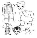
| Early concept | Created for the unfinished book Homestar Runner and The Brothers Strong. Later adapted for Strong Mad's Storybook World design. | 1996 | Sketchbook (museum) Middle right: flashback; alternate universe; Homestar Runner Goes for the Gold; The Homestar Runner Enters The Spooky Woods | N/A |
| First design | 1999 | Marshmallow's Last Stand; Old Characters Page | Strong Mad's design has been greatly streamlined from the initial concepts, with no visible indication of a head. His singlet is black, with an M symbol on the center. | |
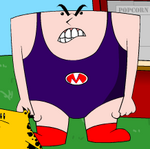
| Second design | 2000 | A Jumping Jack Contest; Strong Libs; Yearbook Character Page (in photo); Dancin' Bubs; Character Cards | Strong Mad has been redrawn, primarily using clean vector shapes with consistent line weights rather than rougher traced lines; in particular, his fingers and boots are more defined and his nose is more triangular. He no longer has visible chest hairs, and his "M" crest is simplified. His eyes are slightly larger and have highlights, while his eyebrows are bolder and more defined.
Most of the shading has been removed, his skin is a more natural flesh tone rather than pink, and his singlet has changed to purple. | |
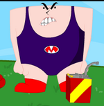
| Third design | 2000 | Theme Song Video; Strong Bad Sings; Homestarloween Party; 2022 Costume Pack Now Available | His outlines are now colored. Minor tweaks to his proportions have been made — his facial features are slightly higher and smaller, and his legs slightly stockier. | |
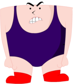
| Fourth design | 2000 | A Holiday Greeting; Tis True, Pom Pom, Tis True; Yearbook Character Page | Strong Mad's facial features have been adjusted to be smaller and lower, and his eyebrows are less arched and rest higher — making his gaze appear more forwards than upwards. His body now has shading, and the "M" on his singlet has been removed. | |
| Fifth design | 2001 | A Jorb Well Done, The Luau, The House That Gave Sucky Treats | The "M" on his singlet has returned with a new, more sweeping design. His shoes are a darker shade of red. His mouth is a bit smaller. His nose is facing a different direction, though it does still point left on occasion (usually when he faces left). | |
| Sixth design | This is the current design. | 2001 | Toons from The Best Decemberween Ever to current; various Strong Bad Emails starting with little animal; Teen Girl Squad Issue 10; A Mother's Day Message | Strong Mad is drawn with a darker outline, with varying thickness to imply dimension; shading is also more pronounced and now includes highlights. His facial features have been tweaked again, and his eyebrows are slightly higher and more angular. The "M" is back to a design similar to earlier versions, with more white space around it, and in a slightly different shade of red. His shoes are also a slightly different shade of red.
When he speaks, his voice is slightly higher (this is because his voice is not slowed down like it was in earlier designs) and also raspier. He also talks more often, instead of the occasional growls and grunts he made before. |
| Character Evolutions |
|---|
| Homestar Runner · Strong Bad · Pom Pom · Coach Z · Bubs · The Cheat · Strong Mad · Strong Sad · Marzipan · The King of Town · The Poopsmith · Homsar |


