Character Evolutions
From Homestar Runner Wiki
(compromise; I still like this layout, as it eliminates much of the excessive empty space) |
Bleu Ninja (Talk | contribs) (Add gallery section to describe overall trends in design evolution.) |
||
| Line 1: | Line 1: | ||
| - | [[Image:hs_wallpaper.png|thumb|Through the years]] | + | [[Image:hs_wallpaper.png|thumb|250px|Through the years]] |
Over the years, [[homestarrunner.com]] [[characters]] have undergone a number of changes to their appearance. Below are links to charts for individual characters as they have changed. | Over the years, [[homestarrunner.com]] [[characters]] have undergone a number of changes to their appearance. Below are links to charts for individual characters as they have changed. | ||
__NOTOC__ | __NOTOC__ | ||
| + | == Character Evolutions by category == | ||
{| width="75%" | {| width="75%" | ||
|- | |- | ||
| Line 43: | Line 44: | ||
*[[Nebulon#Character Evolution|Nebulon Evolution]] | *[[Nebulon#Character Evolution|Nebulon Evolution]] | ||
|} | |} | ||
| + | |||
| + | == General design trends== | ||
| + | Many characters were initially designed for [[Original Book|children's books]]. These designs were simple and loose, with thin outlines and bold, solid colors: | ||
| + | <gallery> | ||
| + | File:firsthomestar.png | ||
| + | File:tinyhandedstrongbad.png | ||
| + | File:The cheatachu72.PNG | ||
| + | File:firstpompom.png | ||
| + | </gallery> | ||
| + | |||
| + | When [[The Brothers Chaps]] began using [[Flash]], character designs still kept the hand-drawn feeling (images may have been digitized with {{w|Adobe Streamline}}) with thick, irregular lines. Coloring was often done with gradients: | ||
| + | <gallery> | ||
| + | File:hr3.png | ||
| + | File:StrongBadThirdDesign.png | ||
| + | File:oldthecheat.png | ||
| + | File:pompom evolution iop.png | ||
| + | </gallery> | ||
| + | |||
| + | Around the time of [[A Jumping Jack Contest]], characters were redesigned to use cleaner vector lines with more precise shapes. This art style primarily used black outlines, flat colors, and limited shading: | ||
| + | <gallery> | ||
| + | File:jjhomestar.png | ||
| + | File:sb evolution jumpingjack.png | ||
| + | File:2ndthecheat.png | ||
| + | File:jumpingjackspompom.png | ||
| + | </gallery> | ||
| + | |||
| + | Characters' current designs are typified by colored outlines and the use of shadows, highlights, and varying line width to add depth: | ||
| + | <gallery> | ||
| + | File:NewerestHomestar.png | ||
| + | File:currentbad.png | ||
| + | File:The Cheat Character Video.PNG | ||
| + | File:pompom.PNG | ||
| + | </gallery> | ||
| + | |||
| + | Most character designs have not significantly evolved since 2001. Post-2001 changes typically include minor adjustments to facial or body proportions, additional facial expressions, or reworking how a character is animated, not major changes to how the character is drawn. | ||
| + | |||
==See Also== | ==See Also== | ||
*[[Minor Character Variations]] | *[[Minor Character Variations]] | ||
Revision as of 23:59, 4 May 2023
Over the years, homestarrunner.com characters have undergone a number of changes to their appearance. Below are links to charts for individual characters as they have changed.
Character Evolutions by category
Main Characters |
Old-Timey20X6Storybook World |
Other |
General design trends
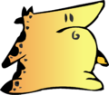
Many characters were initially designed for children's books. These designs were simple and loose, with thin outlines and bold, solid colors:
When The Brothers Chaps began using Flash, character designs still kept the hand-drawn feeling (images may have been digitized with Adobe Streamline) with thick, irregular lines. Coloring was often done with gradients:
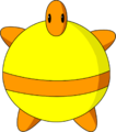
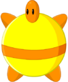
Around the time of A Jumping Jack Contest, characters were redesigned to use cleaner vector lines with more precise shapes. This art style primarily used black outlines, flat colors, and limited shading:
Characters' current designs are typified by colored outlines and the use of shadows, highlights, and varying line width to add depth:
Most character designs have not significantly evolved since 2001. Post-2001 changes typically include minor adjustments to facial or body proportions, additional facial expressions, or reworking how a character is animated, not major changes to how the character is drawn.


