HRWiki:Da Basement/Archive 7
From Homestar Runner Wiki
It's dot com (Talk | contribs) (+favicon target) |
The Cheatbot (Talk | contribs) (autoreplace: Intro → Old New Intro) |
||
| Line 154: | Line 154: | ||
What is the story behind the [[wikipedia:Image:Naval_Ensign_of_Japan.svg|kamikaze]] style background that we currently use? Is there a story? It doesn't have much do with Homestar Runner, except its colors are common to the toon. If this just a case of "it's just always been that way", I'd like to deviate away from them. I there are a lot of other things that could appear in the background. {{User:Invisible_Robot_Fish/sig}} 23:50, 2 November 2006 (UTC) | What is the story behind the [[wikipedia:Image:Naval_Ensign_of_Japan.svg|kamikaze]] style background that we currently use? Is there a story? It doesn't have much do with Homestar Runner, except its colors are common to the toon. If this just a case of "it's just always been that way", I'd like to deviate away from them. I there are a lot of other things that could appear in the background. {{User:Invisible_Robot_Fish/sig}} 23:50, 2 November 2006 (UTC) | ||
| - | :It's a similar style to the [[Intro]]... --{{User:Venusy/Sig}} 23:58, 2 November 2006 (UTC) | + | :It's a similar style to the [[Old New Intro|Intro]]... --{{User:Venusy/Sig}} 23:58, 2 November 2006 (UTC) |
1) I'd like to second the idea of thinking outside the box, although I'm too lazy to do any such thinking at the moment. 2) I don't want to start a side discussion, but I just wanted to mention that all the repetitions of "We're not the HR Wiki" remind me that, in terms of the URL, we are! I found the [http://old.hrwiki.org/index.php?page=WikiIdeas/NewSite discussion] three years ago in which hrwiki was chosen over homestarrunnerwiki. I was about to suggest at this point that we secure the latter, but [http://whois.domaintools.com/homestarrunnerwiki.com someone in the Bahamas] seems to have beaten us to it. 3) I just wanted to make it clear that, while I prefer long blink times to short, I actually ''prefer'' a long blink to none. —[[User:AbdiViklas|AbdiViklas]] 23:59, 2 November 2006 (UTC) | 1) I'd like to second the idea of thinking outside the box, although I'm too lazy to do any such thinking at the moment. 2) I don't want to start a side discussion, but I just wanted to mention that all the repetitions of "We're not the HR Wiki" remind me that, in terms of the URL, we are! I found the [http://old.hrwiki.org/index.php?page=WikiIdeas/NewSite discussion] three years ago in which hrwiki was chosen over homestarrunnerwiki. I was about to suggest at this point that we secure the latter, but [http://whois.domaintools.com/homestarrunnerwiki.com someone in the Bahamas] seems to have beaten us to it. 3) I just wanted to make it clear that, while I prefer long blink times to short, I actually ''prefer'' a long blink to none. —[[User:AbdiViklas|AbdiViklas]] 23:59, 2 November 2006 (UTC) | ||
Current revision as of 02:38, 25 October 2022
Archive 3 (21-30) | Archive 4 (31-40) | Archive 5 (41-50)
Archive 6 (51-60) | Archive 7 (Logo discussion) | Archive 8 (61-82)
Archive 9 (83-102)
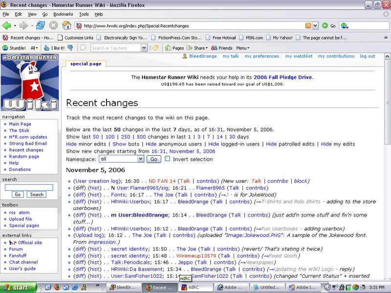
[edit] Updating the WIKI Logo
Some of you may have noticed I made a Wiki Decemberween logo recently. I won't talk about that here yet as it is still a good way soff. But... Well, I was thinking, the current wiki logo is pretty good, but the version of Homestar on it looks pretty outdated from what he actually looks like on the site these days. So I made a few updated versions. It is pretty much the same logo, with minor changes... the biggest being the addition of a more modern Homestar.
- The Current Logo
- A new darker outline
- Outline similar to what we have now
- With a Star Theme - slight blur
- Star Theme - no blur
- BLACK Logo with white Outline (can also be without outline)
- Just a cool animated gif (wait 30 seconds)
- This is a BRAND NEW one that I like a lot.
- Due to popular demand - This is the same as above but he blinks every 15 seconds
- Same as logos above, but this is the PNG (Now homestar is in the field)
- Homestar in the field - blinking (15 second intervals)
- Again, same new style logo, but this time it has the old style bg
- Same as above but animated blinking
- Blinks every 4 seconds
- Blinks every 7 seconds
- Blinks every 13 seconds
- With a Holiday Theme
- No H*R logo anymore
- BRAND NEW Lappy Logo
- Same as above but Homestar blinks like the previous logo idea
- A group shot from Weclome Back
- A welcome back style logo with blinkage!
- Slightly different than the above
- I Improved an earlier design!
- Improved with a shadow added this time
The animated one (although neat) is here just to show something cool I made :). It would be cool but we've already discussed in the chat channel how an animated logo could get annoying, plus it's around 60 kb (double the size of the current normal logo).
I just thought I'd throw this out there. I know tastes are varied.--![]() »Bleed0range« 21:52, 29 October 2006 (UTC)
»Bleed0range« 21:52, 29 October 2006 (UTC)
- I think they look slick. I prefer the darker outline as a change of pace (of color that is, not thickness. The black outline seems to be about the same thickness as what we have now, and that's the way I like it.) Nice work. Vote for hrwikinew_outlined.png. —BazookaJoe 22:28, 29 October 2006 (UTC)
- Definitely, I would like the black or white outline. I also used the globe logo for some time, by the way, I got rid of the text in my CSS monobook but it's still in the uppercorner --Dacheatbot · Communicate 23:28, 29 October 2006 (UTC)
- I think the animated one is very funny, but animation gets old very quick. I am definitely in favor of modernizing Homestar, though. — It's dot com 23:40, 29 October 2006 (UTC)
- I agree. I really like the animated one, but I'm sure it would become distracting soon. I would prefer wikihrlogo_new.png for the new logo, the one with the darker outline might be a bit too prominent. Loafing
 23:57, 29 October 2006 (UTC)
- I agree. I really like the animated one, but I'm sure it would become distracting soon. I would prefer wikihrlogo_new.png for the new logo, the one with the darker outline might be a bit too prominent. Loafing
I made two more new ones. Trying to think "differently."--![]() »Bleed0range« 00:55, 30 October 2006 (UTC)
»Bleed0range« 00:55, 30 October 2006 (UTC)
- I'd like to see a completely different logo. --Trogga 01:53, 30 October 2006 (UTC)
- Me too. But I'm out of ideas. Suggestions?--
 »Bleed0range« 02:21, 30 October 2006 (UTC)
- Me too. But I'm out of ideas. Suggestions?--
The two new ones are too shiny and jumps right in your eyes. I like hrwikinew_outlined.png the best, but will also settle on wikihrlogo_new.png.See new vote below. — Elcool (talk)(contribs) 06:43, 30 October 2006 (UTC)
- Anyone remember where that old alternate logo got to? The one that kinda combined the H*R logo with the wiki? --DorianGray


- Yeah, those ones, Venusy. Just thought they should be mentioned. They are different than our current one, so... Yeah. --DorianGray
- I don't like those two. The green seems odd. But I liked the HR logo idea. I made another that's vastly different from the first ones I made. Black with the HR logo. Take a look. My personal favorite is hrwikinew_outlined.png-- »Bleed0range« 06:22, 31 October 2006 (UTC)
- I don't like those two. The green seems odd. But I liked the HR logo idea. I made another that's vastly different from the first ones I made. Black with the HR logo. Take a look. My personal favorite is hrwikinew_outlined.png--
- It's got potential. But: the black background stands out too much from the page, it should be something much lighter. Basic layout rules also suggest that Homestar faces right if he's on the left border of the screen. And I personally like it much better with Homestar looking at the reader (i.e. with the eyes reversed compared to the current black logo). Having said that, I think it's cool to replace the text "Homestar Runner" with the h*r logo. We'll have to make sure that we still look like an independent wiki, though. Hmmm, have you thought about moving Homestar up a bit, so that the star on his shirt basically replaces the star from the logo? Loafing 01:50, 1 November 2006 (UTC)
- It's got potential. But: the black background stands out too much from the page, it should be something much lighter. Basic layout rules also suggest that Homestar faces right if he's on the left border of the screen. And I personally like it much better with Homestar looking at the reader (i.e. with the eyes reversed compared to the current black logo). Having said that, I think it's cool to replace the text "Homestar Runner" with the h*r logo. We'll have to make sure that we still look like an independent wiki, though. Hmmm, have you thought about moving Homestar up a bit, so that the star on his shirt basically replaces the star from the logo? Loafing
- Well I was trying to get it to look like his star shirt replaced the start in H*R. It's hard to get the HR logo and Homestar to fit with-in the dimensions of the small logo and still be visible to a pleasing extent. The logo was thrown together as an idea. I could make another, possibly a white one instead of black... or maybe I could use the kind of background that the current one has but with the H*R logo idea. What is the dimension limit for the logo anyway? So I know what I can work with.-- »Bleed0range« 02:38, 1 November 2006 (UTC)
- Well I was trying to get it to look like his star shirt replaced the start in H*R. It's hard to get the HR logo and Homestar to fit with-in the dimensions of the small logo and still be visible to a pleasing extent. The logo was thrown together as an idea. I could make another, possibly a white one instead of black... or maybe I could use the kind of background that the current one has but with the H*R logo idea. What is the dimension limit for the logo anyway? So I know what I can work with.--
- This doesn't really have anything to do with the above logos, but I think it'd be cool to have Homestar blink every so often (like on your userpage, BleedOrange). —FireBird|Talk 02:10, 1 November 2006 (UTC)
- Yeah, but that's animated, thus more kilobytes, thus making it harder to load and such. Cool idea, though. -Brightstar Shiner 02:27, 1 November 2006 (UTC)
- I think I like the idea of the blinking...and it would only require three or four different frames at most, right? (just with varying lengths of time) I actually like the basic style of the current logo, but I'm interested to see whether or not other users think it would be distracting to have the logo blink. (by the way, of the options you suggested, I like #3 the best.)
 Trey56 03:29, 1 November 2006 (UTC)
- I think I like the idea of the blinking...and it would only require three or four different frames at most, right? (just with varying lengths of time) I actually like the basic style of the current logo, but I'm interested to see whether or not other users think it would be distracting to have the logo blink. (by the way, of the options you suggested, I like #3 the best.)
OK guys. My latest one looks pretty darn good, I think. I added two new images. I took the HR logo idea and tried to make it seem as though Homestar's Star on his shirt replaces the star in the logo. The first image is just a regular PNG image. It's about 30 kb in size (28 I think). It's nice and different. (I personally like it with his mouth open) Second image is him blinking (due to popular demand). It's actually only 11 kb I think and pretty small. He blinks only once for a split second every 15 seconds. I can increase that or decrease that timing depending on how obtrusive you guys think it would be. After making it, I honestly don't find it to be all that distracting of an animation. This is probably the last image I'll make as it's my personal favorite as far as approaching something new. Otherwise, if this logo isn't a suitable replacement, maybe we should stick with the older type design with an updated Homestar. Please do let me know what you think of this new one. I like it a lot.--![]() »Bleed0range« 05:03, 1 November 2006 (UTC)
»Bleed0range« 05:03, 1 November 2006 (UTC)
- Wow! I really, really, like that brand new blinking one. I say we go for it. It isn't that distracting, but if we get sick of it, we can always switch to the png. And then when we get sick of that after a year or two, we can switch to the wealth of rock-rock-on logos Bleed0range has made. —BazookaJoe 05:13, 1 November 2006 (UTC)
- I'm all for the blinking one, now. That or the dark outline. The blinking would probably work better if he blinked once every 3 seconds or so. However often he blinks in the cartoon works. — Lapper (talk) 05:14, 1 November 2006 (UTC)
- Disagree. 15 seconds or more is good. 90% of our viewing population doesn't know or care how often he blinks, anyway. I'd rather go with something that's less distracting for me. —BazookaJoe 05:17, 1 November 2006 (UTC)
- I disagree with that. Homestar blinks every appx. 3.9 seconds; set it to 15 and his little eyes will dry out, and more importantly, then why bother with the blinking as 95% of the viewers never see it happen? I say do it as it's done in the toons or don't at all. - Qermaq - (T/C)
 10:09, 1 November 2006 (UTC)
- I disagree with that. Homestar blinks every appx. 3.9 seconds; set it to 15 and his little eyes will dry out, and more importantly, then why bother with the blinking as 95% of the viewers never see it happen? I say do it as it's done in the toons or don't at all. - Qermaq - (T/C)
- I like the 15 second delay, but what about making the background transparent/adding in a non-white background? By the way, great work so far.... Trey56 05:28, 1 November 2006 (UTC)
- I like the 15 second delay, but what about making the background transparent/adding in a non-white background? By the way, great work so far....
Ok, I couldn't sleep. I feel like I need to finish this thing. I tried making a transparent image, but it didn't look so good around the logo (and the white glow around Homestar looked awful transparent). So I changed the bg color but it didn't seem right. SOOOo.. I put him in a natural setting. The Field. Tell what u think! I'd like to hear. I think it looks nice.--![]() »Bleed0range« 06:54, 1 November 2006 (UTC)
»Bleed0range« 06:54, 1 November 2006 (UTC)
OK! Added two more images. lol. I thought maybe the new logo idea would look best with the old logo's style of background. Take a look. A stationary and an animated one again. This is my personal favorite so far. I think this is the best look.--![]() »Bleed0range« 08:15, 1 November 2006 (UTC)
»Bleed0range« 08:15, 1 November 2006 (UTC)
- There's a slight visual hiccup in the text for the animated Field and animated blue background logos. --DorianGray
- I know, I fixed it. I forgot to change the bevel/emboss on the text from one frame to the next. It works right now.-- »Bleed0range« 08:34, 1 November 2006 (UTC)
- I know, I fixed it. I forgot to change the bevel/emboss on the text from one frame to the next. It works right now.--
Same hiccup happens for #13; despite this,I think #13 is perfect, and I would be happy with it as a replacement, personally.Trey56 08:33, 1 November 2006 (UTC)
- Well. The only reason I put a 15 second timer on the blinking is because I thought it might be too obtrusive if it were less than that. I can adjust the blinking to 4 seconds (which is what the one on my user page does) or pretty much anything. Do you guys want it to be 4 seconds or do you want it to be more than that? (3.9/4 is what the HR cartoons do I think).-- »Bleed0range« 16:09, 1 November 2006 (UTC)
- Well. The only reason I put a 15 second timer on the blinking is because I thought it might be too obtrusive if it were less than that. I can adjust the blinking to 4 seconds (which is what the one on my user page does) or pretty much anything. Do you guys want it to be 4 seconds or do you want it to be more than that? (3.9/4 is what the HR cartoons do I think).--
- Can you get rid of that white glow around Homestar? It looks out of place. --Trogga 18:24, 1 November 2006 (UTC)
- I like the white glow, personally. If anyone else agrees with you Trogga, I'll take it out. Otherwise it's staying. I made another logo. This one blinks quicker than the other one. I did 7 seconds. 4 seconds still seems too fast but I made one that does that too just so you could compare. And for the heck of it I made a 13 second one. I am kinda covering all the bases so please let me know which one you like most.-- »Bleed0range« 18:42, 1 November 2006 (UTC)
- I like the white glow, personally. If anyone else agrees with you Trogga, I'll take it out. Otherwise it's staying. I made another logo. This one blinks quicker than the other one. I did 7 seconds. 4 seconds still seems too fast but I made one that does that too just so you could compare. And for the heck of it I made a 13 second one. I am kinda covering all the bases so please let me know which one you like most.--
- I don't think we should use anything that uses their official logo in any way. Using Homestar is one thing, but using part of their actual logo as our logo just seems forreallywrong. Also, it needs to have the words "Homestar Runner Wiki" on it. — It's dot com 18:48, 1 November 2006 (UTC)
- I think people will still know that we're the Homestar Runner Wiki, not the H*R Wiki. --Trogga 19:06, 1 November 2006 (UTC)
- It's dot com, I don't see anything wrong with using the H*R logo at all. The point of the logo is for Homestar's star shirt to represent the start in H*R... and everyone knows who is coming to the site (or can figure it out relatively easy) what H*R is. I could add the words Homestar Runner but then that would downplay the reason the logo and Homestar is in it. You have a problem with using the logo for what reason though? The icon that we use in the URL has the H*R logo on it with a big W below it. Which is the same concept. If you had a problem (or have) with that idea then the icon shouldn't use it either. And what's the difference between using the barrage of screenshots on the site or the image of Homestar himself versus the logo. Do you think people will get us confused as the official Homestar Runner Wiki? There is no official wiki so they can't confuse us with one. Besides, this is the closest thing to an official one if there was one. The logo is an integral part of the H*R universe and I see the logo pretty much all over this wiki. I see it next to links to the official site, etc. So I don't see how it being in our logo is that big of a deal. This wiki already looks very professional and if they were going to make the leap to think it is tied in to the official website somehow they probably already would have.-- »Bleed0range« 00:35, 2 November 2006 (UTC)
- It's dot com, I don't see anything wrong with using the H*R logo at all. The point of the logo is for Homestar's star shirt to represent the start in H*R... and everyone knows who is coming to the site (or can figure it out relatively easy) what H*R is. I could add the words Homestar Runner but then that would downplay the reason the logo and Homestar is in it. You have a problem with using the logo for what reason though? The icon that we use in the URL has the H*R logo on it with a big W below it. Which is the same concept. If you had a problem (or have) with that idea then the icon shouldn't use it either. And what's the difference between using the barrage of screenshots on the site or the image of Homestar himself versus the logo. Do you think people will get us confused as the official Homestar Runner Wiki? There is no official wiki so they can't confuse us with one. Besides, this is the closest thing to an official one if there was one. The logo is an integral part of the H*R universe and I see the logo pretty much all over this wiki. I see it next to links to the official site, etc. So I don't see how it being in our logo is that big of a deal. This wiki already looks very professional and if they were going to make the leap to think it is tied in to the official website somehow they probably already would have.--
- I have wanted to change the favicon for a while now; it was made before I had a say. Either way, it is irrelevant to this discussion. Repurposing their official logo as our big, main, official logo is not what we should do. There are plenty of other ways we could design our logo that would be just as good or better. — It's dot com 00:46, 2 November 2006 (UTC)
- Well. Not to be rude. But your say alone does not make this decision. It will have to be weighed in with other's thoughts. I do respect your side though. I understand this arguement, but your just getting into territory of whether or not we should have a logo at all. I do not believe anyone's going to confuse this with being official, neither do I think they'll have a hard time figuring out what H*R means. And I never saw the logo as anything more than the letters H and R with Homestar standing in front of it. I realize that it's the official logo. I've seen about a billion Star Wars sites that use the same logo used officially and no one has a problem with that. Most fan sites do that sort of thing. And the wiki fits the bill in that sense. And the favicon is NOT irrelevant to this discussion. If your going to bring up the question of whether we should use the H*R logo at all, obviously the favicon is part of that.-- »Bleed0range« 01:07, 2 November 2006 (UTC)
- Well. Not to be rude. But your say alone does not make this decision. It will have to be weighed in with other's thoughts. I do respect your side though. I understand this arguement, but your just getting into territory of whether or not we should have a logo at all. I do not believe anyone's going to confuse this with being official, neither do I think they'll have a hard time figuring out what H*R means. And I never saw the logo as anything more than the letters H and R with Homestar standing in front of it. I realize that it's the official logo. I've seen about a billion Star Wars sites that use the same logo used officially and no one has a problem with that. Most fan sites do that sort of thing. And the wiki fits the bill in that sense. And the favicon is NOT irrelevant to this discussion. If your going to bring up the question of whether we should use the H*R logo at all, obviously the favicon is part of that.--
- I agree with Dot Com. We shouldn't use the official logo so as not to confuse people (even though your suggestions look really cool, bleedy). Loafing 01:27, 2 November 2006 (UTC)
- I agree with Dot Com. We shouldn't use the official logo so as not to confuse people (even though your suggestions look really cool, bleedy). Loafing
I added another image. To show you what it would look like as a Holiday logo. I know it needs some work on the snow, I can fix that later. This was a quick setup.--![]() »Bleed0range« 19:08, 1 November 2006 (UTC)
»Bleed0range« 19:08, 1 November 2006 (UTC)
- Now I love 14 and 15. I say we should go with one of those, preferably 14 but I think it should be whichever one matches his blinking in the toons. How often does he blink in the toons? SaltyTalk! 01:41, 2 November 2006 (UTC)
- I took out the H*R logo just so you guys can see what it looks like without it. It still blinks at 7 seconds. I still like 14 and 15 best as well.-- »Bleed0range« 01:45, 2 November 2006 (UTC)
- I took out the H*R logo just so you guys can see what it looks like without it. It still blinks at 7 seconds. I still like 14 and 15 best as well.--
- Man! I drop in for my increasingly-rare visit and find this cornucopourri of logii! First of all—dang, Mr. Orange. You are prolific. Thanks for all those options.
Secondly, weighing in on the logo discussion above: I don't think the primary concern is that we might be mistaken as official. The primary concern for me is one of copyright. While the wiki (i.e. our original contributions) is CCL, H*R is, at least in their legal page, plain-old all-rights-reserved. While they don't seem to take a very bloodthirsty approach to that—and yeah, it's probably just to cover themselves—we really ought to go by what they say officially, not just "They don't seem like the sueing type." Now the copyright question has come up many times in the past, and my contribution to the conversation is always to point out that I really don't know squat. There might actually be sound defenses for using logos in this way... But even if there are, then the secondary we-really-ought-to-have-a-logo-of-our-own argument comes into play. I like the idea of something alluding to their logo—the way past designs have incorporated the color scheme and rising-sun effect—showing a visual kinship to it, but not exactly the same.
And, finally: about blinking: I like the idea of longer times. In response to "not everyone will see it"—that's kind of what I like about it. It's the same mentality behind Easter eggs (and, before our services, TBC's use of Real-World References that maybe only a handful of people would get). With 4 seconds, the user's train of thought is "Oh, look at that, he's blinking." With something like 13 or even more, it's: "La dee da, reading this page, checkin' out da content, I—what the! Did Homestar just blink?" {stares at logo} "Hm... guess I imagined it... oh well... looking back at the middle of the page and reading the contentYAAAAH! That time I could have sworn he did it!"
Oh, and so far (after just a cursory inspection), I actually really like #4 and 5! (Like, best!) —AbdiViklas 01:57, 2 November 2006 (UTC)
- I think those are some very good points. About the copyright issue, I don't see that it's that much worse to use the H*R logo as part ours than it is to use images of Homestar that were captured from their website, but if there's a good legal/ethical argument for not including their logo as part of ours, then, hey, I'm sure we can find more than one equally-awesome logo. As things stand, we currently have scads of TBC's property all over this wiki; it's a testament to their generosity that they've never said a word about it. On top of this, the we-really-ought-to-have-a-logo-of-our-own argument® is a good one. Have you forgotten what got us here? No Loafing got us here! So let's take another look at Bleedy's suggestions and get back to work! Trey56 03:22, 2 November 2006 (UTC)
- I think those are some very good points. About the copyright issue, I don't see that it's that much worse to use the H*R logo as part ours than it is to use images of Homestar that were captured from their website, but if there's a good legal/ethical argument for not including their logo as part of ours, then, hey, I'm sure we can find more than one equally-awesome logo. As things stand, we currently have scads of TBC's property all over this wiki; it's a testament to their generosity that they've never said a word about it. On top of this, the we-really-ought-to-have-a-logo-of-our-own argument® is a good one. Have you forgotten what got us here? No Loafing got us here! So let's take another look at Bleedy's suggestions and get back to work!
- If you read TBC's legal page. Technically all images, the logo and the likeness of the characters are all copyrighted. The logo is no different than using any images of Homestar or anything like that. Considering TBC themselves use this Wiki, they probably could care less about what the wiki's logo is. So really I do not believe it's any different than using a picture of Homestar with the same font they use for Homsar and copying the basic design of the intro. Which is what the current logo technically is. The logo uses the H*R logo but places Homestar in the middle so his shirt's star replaces their logo's star. It uses their logo but this makes it it's own. The design of that logo is inspired by their own. I could remake their logo in photoshop but that would take forever. Really I don't see how it's that big of a deal. I'm fighting for it pretty hard because I think it's the best representation of what our logo SHOULD look like.-- »Bleed0range« 03:34, 2 November 2006 (UTC)
- If you read TBC's legal page. Technically all images, the logo and the likeness of the characters are all copyrighted. The logo is no different than using any images of Homestar or anything like that. Considering TBC themselves use this Wiki, they probably could care less about what the wiki's logo is. So really I do not believe it's any different than using a picture of Homestar with the same font they use for Homsar and copying the basic design of the intro. Which is what the current logo technically is. The logo uses the H*R logo but places Homestar in the middle so his shirt's star replaces their logo's star. It uses their logo but this makes it it's own. The design of that logo is inspired by their own. I could remake their logo in photoshop but that would take forever. Really I don't see how it's that big of a deal. I'm fighting for it pretty hard because I think it's the best representation of what our logo SHOULD look like.--
I made two BRAND NEW logo ideas. These will probably be my last. I'm running out of ideas. This one is geared around lappy. It features Homestar messing with Strong Bad's computer, in one Homestar blinks and the other has the cursor constantly blinking (probably distracting). I still like my last idea best. #14 and 15. I think that's all the logos I'll be making. It's time for some decision making to go down ya'll!--![]() »Bleed0range« 03:25, 2 November 2006 (UTC)
»Bleed0range« 03:25, 2 November 2006 (UTC)
- 20's pretty good. I like it. Others are nice too, but this one's unique. BTW I agree on not using the h*r logo, bot for any trademark reasons but just so we do something different to set us apart from the canon site. - Qermaq - (T/C) 03:53, 2 November 2006 (UTC)
- To clarify, my problem with using the official H*R logo as part of our logo is not from any legal concern (it has been pointed out numerous times that this whole site exists only because TBC allow it to), but rather it's an ethical one. Taking someone else's logo, or even imitating it, to use as one's own logo crosses some line in my mind. I don't have problems with using elements from the official site for use on our site like we currently do, but we shouldn't brand ourselves using their actual logo. — It's dot com 03:57, 2 November 2006 (UTC)
- I just never thought of the H*R logo as the logo for THE SITE. But rather the logo for all that is Homestar Runner. The logo for Homestar himself perhaps. Which is why I thought aprorpiate to use it. I think of it more as a character's logo or the logo of the universe than just the logo for the site. I see what you mean, but I didn't really find it inapropriate.-- »Bleed0range« 04:01, 2 November 2006 (UTC)
- I just never thought of the H*R logo as the logo for THE SITE. But rather the logo for all that is Homestar Runner. The logo for Homestar himself perhaps. Which is why I thought aprorpiate to use it. I think of it more as a character's logo or the logo of the universe than just the logo for the site. I see what you mean, but I didn't really find it inapropriate.--
I couldn't help but muddy the waters, and I was bored, so I added my own idea for a logo (#21). Discuss and/or mock as you please. ![]() Trey56 08:29, 2 November 2006 (UTC)
Trey56 08:29, 2 November 2006 (UTC)
- Ok, a lot of new logos were added since I last checked the page. I viewed them all and read all the talk around the logo/no-logo sides, and I've got to support the no-logo side. 1. Personally, I think it looks better and the font is more consistent. 2. The full name of the wiki is shown: We're not the "h*r Wiki", but the "Homestar Runner Wiki". 3. All the legal reasons mentioned before me, and 4. We're a different site, being run by different people and therefor need a different logo.
That being said, I support logo 18 (nologo_blink.gif): It's different while staying similar to the old one and the blinking looks best that way. — Elcool (talk)(contribs) 18:31, 2 November 2006 (UTC)
- This is fast becoming an expansive discussion. Instead of various lengthy opinions, which may take weeks to reach consensus, if any, perhaps some sort of poll is in order? — Lapper (talk) 18:51, 2 November 2006 (UTC)
- Even though this has already become a lengthy discussion, I think it's too soon for a poll. I feel that we are still in the creative process of finding a logo. Loafing 20:31, 2 November 2006 (UTC)
- Even though this has already become a lengthy discussion, I think it's too soon for a poll. I feel that we are still in the creative process of finding a logo. Loafing
- I'm no image editor, but I'd like a logo that symbolizes the wiki somehow. --Trogga 20:50, 2 November 2006 (UTC)
- I agree with E.L. Cool in that logo 18 looks the best. I think we should touch it up more and work on it a little bit (I'd like to see a different color for the text, maybe), but I think we're off to a great start. —FireBird|Talk 21:29, 2 November 2006 (UTC)
What is the story behind the kamikaze style background that we currently use? Is there a story? It doesn't have much do with Homestar Runner, except its colors are common to the toon. If this just a case of "it's just always been that way", I'd like to deviate away from them. I there are a lot of other things that could appear in the background. ![]() I R F
I R F ![]() 23:50, 2 November 2006 (UTC)
23:50, 2 November 2006 (UTC)
1) I'd like to second the idea of thinking outside the box, although I'm too lazy to do any such thinking at the moment. 2) I don't want to start a side discussion, but I just wanted to mention that all the repetitions of "We're not the HR Wiki" remind me that, in terms of the URL, we are! I found the discussion three years ago in which hrwiki was chosen over homestarrunnerwiki. I was about to suggest at this point that we secure the latter, but someone in the Bahamas seems to have beaten us to it. 3) I just wanted to make it clear that, while I prefer long blink times to short, I actually prefer a long blink to none. —AbdiViklas 23:59, 2 November 2006 (UTC)
- And someone in California has homestarrunnerwiki.org. Wow. -- Tom 00:36, 3 November 2006 (UTC)
- Call me old fashioned but I prefer #3, possibly with some very scant blinking thrown in. - Joshua 02:54, 3 November 2006 (UTC)
I made some more logos. I think we should go with #2 or #18, personally if you guys want to stay close to the way the logo looks but update Homestar. (#18 is my favorite of the two). What do you guys say?--![]() »Bleed0range« 05:46, 3 November 2006 (UTC)
»Bleed0range« 05:46, 3 November 2006 (UTC)
- I like your logos, Bleed, but can't you give the characters better resolution? --Trogga 13:18, 3 November 2006 (UTC)
- Well, that's the size of the logo. There can't be any better or worse resolution than that. Loafing 19:03, 3 November 2006 (UTC)
- Well, that's the size of the logo. There can't be any better or worse resolution than that. Loafing
- That should be discussed on the Fanstuff wiki, not here. Loafing 22:09, 3 November 2006 (UTC)
- That should be discussed on the Fanstuff wiki, not here. Loafing
- Sorry for asking. ;/ --Trogga 22:16, 3 November 2006 (UTC)
- I agree. Number 18 is my favorite. It's not such a drastic change from the original, but it has a slightly updated feel to it. — Lapper (talk) 23:31, 3 November 2006 (UTC)
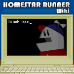
Here is my first concept. I didn't pay attention to exact pixel dimension or file size (all that can be tweeked later) ![]() I R F
I R F ![]() 20:01, 5 November 2006 (UTC)
20:01, 5 November 2006 (UTC)

- I like the logo, but there are a few things. The Basement is more Strong Bad's territory than Homestars... and... I don't think you can fit the logo into the correct dimensions while keeping Homestar in it and the side of the wall visible with the text readable.-- »Bleed0range« 20:34, 5 November 2006 (UTC)
Ok guys.... and gals... this is it. I improved an earlier design. I think #24 and #25 are the BEST BET your going to get on a new logo. It's animated to blink like before. I added a white outline around H*R so he stands out better against the background. I improved some pixelation problems (you probably won't notice) and tweaked it here and there for overall better quality. I like it for a number of reasons. But most notable are: (1.) I like that this is a new Homestar Runner pose and features more of his body than the older logo. It's like he is saying "Homestar! ... Runner! .... Homestar Runner Wiki!" (2.) It's a more modernized version of Homestar that better represents what he looks like in toons today (3.) It's unique for the wiki and it looks good. The animation is cool because it's similar to what he does on the website (the blinking), even on the enter page. (4.)Change is a good thing. For all those reasons and more I believe it is a GOOD IDEA to change the wiki logo to this, either #24 or #25. What say you, wiki!?--![]() »Bleed0range« 22:13, 5 November 2006 (UTC)
»Bleed0range« 22:13, 5 November 2006 (UTC)
- I don't feel that 24 or 25 is an improvement in any way upon 18. So, in any case, I prefer 18. — Lapper (talk) 22:15, 5 November 2006 (UTC)
- Examples of what they would look like on the page are: here and here. I think they're my best so far. But between the two I like #24 best. WIthout the shadow.-- »Bleed0range« 22:21, 5 November 2006 (UTC)
- Examples of what they would look like on the page are: here and here. I think they're my best so far. But between the two I like #24 best. WIthout the shadow.--
- Between 18 and 24/25, I like 18's outline behind Homestar a little better (the fadey version). Trey56 22:42, 5 November 2006 (UTC)
- Between 18 and 24/25, I like 18's outline behind Homestar a little better (the fadey version).
